Ever wondered why printed materials don’t always match what you see on screen? It’s all about color systems. For brands wanting the same look everywhere, picking between Pantone and CMYK is key. It can mean the difference between great results and big disappointments.
Color is vital in product packaging and brand identity. The right color can evoke feelings, build recognition, and share values without words. But many designers and business owners find it hard to keep colors the same across different platforms.

The Pantone Matching System and CMYK are two ways to show colors. One gives exact formulas for matching, while the other mixes four inks for a wide range of colors. Knowing when to use each can save money and keep your brand looking consistent.
Professionals deal with these color matching systems every day. They choose based on the project, budget, and what they want to achieve. The choice affects costs and how the final product looks.
Key Takeaways
- Pantone and CMYK represent fundamentally different approaches to color reproduction
- Color system selection directly impacts brand consistency across media
- The Pantone Matching System offers standardized formulas for exact color matching
- CMYK uses four ink colors (Cyan, Magenta, Yellow, and Key/Black) to create color variations
- Understanding both systems helps avoid costly production mistakes
- Different printing projects may require different color systems for optimal results
Table of Contents
What is PMS Color? Understanding the Pantone Matching System
The Pantone Matching System (PMS) is a precise way to identify and reproduce exact colors. It uses pre-mixed inks and standardized codes. This standardized color-matching system helps designers, brands, and printers communicate specific colors clearly.
When a designer says Pantone 185 C, printers worldwide can make that exact red shade. This ensures colors are consistent on all materials, from business cards to billboards.
The PMS creates colors differently than traditional printing. Instead of layering dots, each Pantone ink is a custom mix. This method makes colors like vibrant oranges and deep blues possible.
The History and Development of Pantone
Pantone started in 1963 by Lawrence Herbert, a chemistry graduate. He saw the need for accurate color communication in printing and design.
Herbert bought the printing division and turned it into Pantone. He created a color numbering system that made color matching objective. By the 1970s, the Pantone system was the standard for many industries.

How the Pantone Matching System Works
The PMS is based on standardization through precise formulation. Each Pantone color has a unique number and formula. These formulas show the exact mix of pigments for that color.
Printers use these formulas to mix inks for specific colors. This ensures colors are the same everywhere. Unlike CMYK, spot colors in PMS are solid inks applied directly.
The system has thousands of colors, each with a unique color code. These codes help identify colors, like Pantone 300 C.
The Pantone Color Guides and Libraries
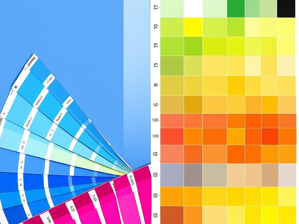
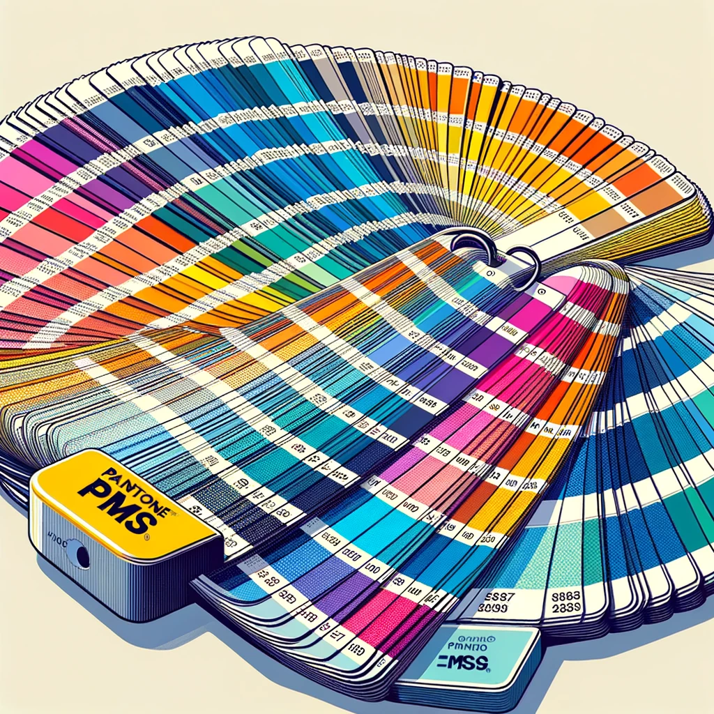
Designers and printers use Pantone color guides to choose colors. The Pantone Formula Guide shows solid colors on different papers. It’s in fan-deck format for easy color comparison.
Pantone also has specialized libraries for different fields. The Color Bridge guide shows how Pantone colors match CMYK. The Fashion, Home + Interiors system is for textiles and interior design.
The Pantone website and digital tools have updated how designers use the system. These tools let professionals browse, select, and share colors digitally. They keep the precision that made the Pantone® Matching System revolutionary.
The CMYK Color Model Explained
The CMYK color system is different from digital displays. It uses four ink colors to create printed images. This happens through a subtractive process where ink absorbs certain light wavelengths and reflects others.
CMYK stands for Cyan, Magenta, Yellow, and Key (black). These colors mix to create a wide range of printed colors. From magazines to posters, this model is key for printing images.

The Four-Color Process: Cyan, Magenta, Yellow, and Key (Black)
The four color process starts with three primary colors and black. Cyan is a bright blue, magenta a vibrant pink-purple, and yellow is yellow. The “K” in CMYK stands for “Key” – black ink.
Each color has a role in creating the final image. Cyan and Magenta make blues and purples. Cyan and Yellow create greens. Magenta and Yellow make reds and oranges. Mixing all three colors creates a dark brown, not black.
That’s why Key (black) is crucial. It adds depth and contrast, making images sharper and more defined.
Limitations of the CMYK Color Gamut
The CMYK color model has big limitations. It can’t reproduce many vibrant colors seen on digital screens. This is because it has a limited color range.
Colors like bright oranges and certain purples are hard to print. They appear duller than on screens. Metallic and fluorescent colors also can’t be printed accurately.
The surface of the paper affects color too. Colors look different on glossy paper than on newsprint. This makes color matching across different materials tricky.
Designers and brands need to understand these limits. They often use Pantone for precise color matching.
Key Differences Between PMS and CMYK Color Systems
Understanding the differences between PMS and CMYK color systems is crucial. These differences impact color accuracy and production costs. Knowing these differences helps you make better choices for your print projects, balancing quality and budget.
Color Accuracy and Consistency Comparison
PMS offers superior color accuracy compared to CMYK. It’s the top choice for brands needing exact color matches across all materials. With PMS, you get pre-mixed inks that match specific color standards, ensuring consistent colors on business cards, brochures, and packaging.
CMYK, while versatile, blends four inks to create colors. This blending introduces variables that can change the final color. Printing the same design on different days or machines may show slight color differences, unlike PMS.
The color gamut (range of reproducible colors) is different between these systems. PMS can produce vibrant oranges, deep purples, and metallic finishes that CMYK can’t. For brands with specific color needs, this CMYK limitation is a major issue.
Production Methods: Spot Colors vs. Process Colors
The main production difference is how color is applied to paper. PMS uses spot colors – individual, pre-mixed inks applied separately during printing. Each PMS color needs its own printing plate and ink well, ensuring precise color control.
CMYK uses a four-color process where cyan, magenta, yellow, and black inks combine in varying percentages to create a full spectrum of colors. These four inks print as tiny dots that blend visually to create the desired color. While efficient for full-color images, this method sacrifices some precision for versatility.
Cost Considerations for Each System
Budget often decides which color system is best for your project. PMS is usually more expensive because each color requires separate setup, additional press time, and specialized inks. A three-color PMS job needs three different printing plates and three press runs, increasing labor and material expenses.
CMYK is more economical for multi-color projects since it uses just four standard inks, regardless of the design’s colors. For full-color photographs or designs with color gradients, CMYK offers significant cost savings without extra setup.
Feature | PMS Color System | CMYK Color System | Best For |
Color Accuracy | Highly accurate, consistent | Variable, less precise | PMS for brand colors |
Color Range | Wider gamut, includes metallics | Limited gamut, no metallics | PMS for specialty colors |
Production Method | Spot colors, separate plates | Four-color process | CMYK for photographs |
Cost Factor | Higher setup costs | More economical for full color | CMYK for budget projects |
Setup Time | Longer (separate plate per color) | Faster (standard four plates) | CMYK for quick turnarounds |
When to Use PMS Colors in Your Projects
PMS colors offer unmatched precision and consistency in design projects. They outperform CMYK in many ways. Knowing when to use PMS colors is key for designers. It helps balance quality, brand integrity, and budget.
Brand Identity and Logo Design
Consistent color is crucial for brand recognition. Big names like Coca-Cola and Tiffany use solid PMS colors to keep their look. This ensures logos look the same everywhere, from business cards to billboards.
The Pantone Formula Guide gives exact color specs for any printer worldwide. This is vital for global brands. It helps them keep their look consistent across different regions and printers.
Packaging and Product Design
Packaging needs color consistency to stand out on shelves. Printing with Pantone ensures packages look the same, no matter when or where they’re made.
Luxury brands benefit a lot from using the PMS system. It gives them the high-quality colors their customers expect. The system’s wide range of colors helps designers show off a brand’s unique style.
Special Printing Effects and Metallic Colors
The PMS system is great for colors CMYK can’t match. It’s perfect for vibrant neons and metallics. PMS inks make these colors possible.
Special finishes like gold and silver need specific Pantone colors. These finishes make materials pop and leave a lasting impression. They’re perfect for grabbing attention in crowded markets.
For these special effects, designers should pick the right PMS color early. This ensures the printer knows what to do and can estimate costs accurately.
When CMYK is the Better Choice
For many design projects, CMYK is the best choice. It offers quality, versatility, and cost-effectiveness. While PMS colors are great for specific uses, CMYK is the go-to for most printed materials. Knowing when to use this commonly used color system helps designers make better choices.
Full-Color Photography and Detailed Images
CMYK is best for photos and complex images. It uses cyan, magenta, yellow, and black to create smooth gradients and realistic images. Spot colors can’t match this quality.
Magazines, catalogs, and marketing materials with photos benefit from CMYK. It’s great for skin tones, landscapes, and product photos where detail is key. With CMYK, the human eye sees a wide range of colors from just four inks.
Budget-Conscious Projects
CMYK is often the best choice for saving money. It uses just four inks to create a wide range of colors. This is different from PMS, which needs separate plates and ink for each color.
This saves a lot of money, which is great for projects with many color schemes or full-color images. Businesses on a tight budget find CMYK offers professional results without the high cost of custom PMS colors.
Digital-to-Print Workflows
Design often starts in digital spaces where RGB colors are common. CMYK works well with these digital workflows. Most design software has tools to convert RGB colors for printing to CMYK.
This makes CMYK perfect for projects that switch between digital and print. Designers and printing experts can be sure what they see on screen will match the printed product.
Project Type | CMYK Advantages | PMS Advantages | Recommended System |
Photography Books | Better image reproduction | Limited for photos | CMYK |
Corporate Brochures | Cost-effective for multiple colors | Precise brand colors | CMYK with PMS accents |
Newspapers | Fast, economical production | Too expensive for large runs | CMYK |
Art Reproductions | Wide color range | Specific color matching | CMYK with PMS enhancement |
Digital-First Content | Easier digital-to-print conversion | Difficult to match on screens | CMYK |
Color Accuracy and Brand Consistency Across Media
Keeping your brand colors the same on all platforms is key. Your logo should look the same on business cards, websites, and packaging. But, different color systems can change how colors look.
Converting Between Color Systems
Switching between color spaces needs a good understanding of their differences. RGB or hex color codes look different in CMYK or PMS. Digital blues can look dull in print, and bright oranges might fade.
Start with the right color system for your main medium. Use PMS or CMYK for print, and rgb color for digital. Then, translate carefully to match both.
Managing Color Expectations in Different Media
It’s important to set clear color expectations for clients. Tell them that perfect color matches are hard due to color creation differences.
Many things can change how we see colors. Paper, printing, screen settings, and lighting all play a part. Show clients color samples in different formats to prepare them for variations.
Tools for Color Management and Matching
Professional color profiles and tools help keep colors consistent. Tools like spectrophotometers make sure screens show colors correctly. Software translates between systems well.
Color libraries and swatch books help designers choose colors that work well everywhere. Digital tools like Pantone Connect help match colors closely, no matter the medium.
For important brand uses, make a detailed style guide. Include color values in PMS, CMYK, RGB, and hex color. This keeps your brand colors consistent everywhere.
Choosing the Right Color System for Your Printing Needs
Choosing between PMS and CMYK depends on your project’s goals and budget. PMS is best for brand materials needing exact color. It ensures your logo looks the same on all materials.
CMYK is great for projects with photos or detailed graphics. It’s perfect for magazines and catalogs with lots of images.
Cost is also a factor. PMS colors are pricier but match colors exactly. CMYK is cheaper for big print jobs but still looks good.
Think about these questions when deciding:
- Does your project need exact brand color matching?
- Are you printing photos or detailed images?
- What materials will you print on?
- How crucial is color for this project?
Some projects use both systems. Use CMYK for most parts and PMS for your logo. This keeps your brand colors consistent.
Knowing each system’s strengths helps you pick the best colors for your projects. This balances what you want with what’s practical.


