Why Color Codes Exist
A color code is a standard way to define an exact color so it reproduces the same way across different devices and materials. Without these standards, “red” could mean a hundred different shades depending on the screen, the printer, or the ink.
The split comes down to how the color is produced. Screens emit light, so they add colored light together to build every shade. Printed materials reflect light, so they layer ink that absorbs certain wavelengths and reflects the rest. These are two physical processes, and each needs its own color model.
That difference matters for every print job. A file built for screen viewing will not translate cleanly to ink without conversion, and that conversion is where colors shift.
CMYK: The Color System for Print
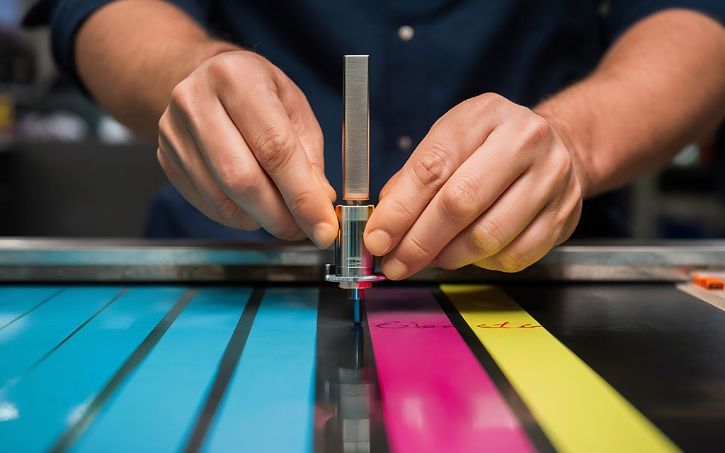
CMYK stands for Cyan, Magenta, Yellow, and Key (black). It is the standard color model for almost all commercial printing, from business cards to vehicle wraps.
How CMYK Works
CMYK is a subtractive color model. It starts with a white sheet and subtracts brightness by layering ink. Each of the four inks absorbs part of the light spectrum. Combine them in different amounts and you get a wide range of colors. Layer all four at full strength and you get close to black, though printers add a dedicated black (the K) because mixing the other three produces a muddy dark brown rather than a true black.
The four values are written as percentages from 0 to 100. A rich red might read C:0 M:99 Y:100 K:0. Each number tells the press how much of that ink to lay down.
When to Use CMYK
Use CMYK for anything that will be printed with standard process printing:
- Brochures, flyers, and postcards
- Business stationery and menus
- Posters and banners
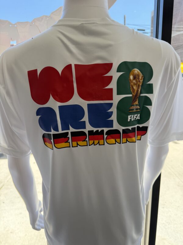
- Full-color apparel prints using DTG or DTF
- Any job with photographs or complex color gradients
If a printer asks for a print-ready file, they expect CMYK unless you have agreed on spot colors.
The Limitations of CMYK
CMYK covers a smaller range of colors than screens can display. This range is called the gamut. Bright, saturated colors like neon green, electric blue, or vivid orange often sit outside the CMYK gamut, which means they cannot be reproduced exactly with standard inks. The printed version comes out more muted than the screen version.
This is the single most common surprise for people sending their first print job. The fix is to design in CMYK from the start so you see the realistic printed range while you work, not after the proof arrives.
RGB: The Color System for Screens
RGB stands for Red, Green, and Blue. It is the color model for anything viewed on a screen: websites, phone displays, digital ads, and video.
How RGB Works
RGB is an additive color model. It starts with black (a screen with no light) and adds red, green, and blue light to create color. Combine all three at full intensity and you get white. This is the opposite of how CMYK builds color.
Each of the three values runs from 0 to 255. Pure red is R:255 G:0 B:0. White is R:255 G:255 B:255. This gives RGB access to roughly 16.7 million possible colors, far more than CMYK can print.
When to Use RGB
Use RGB for any screen-based work:
- Websites and landing pages
- Social media graphics and digital ads
- Email design
- Video and motion graphics
- Digital presentations
Why RGB Files Cause Print Problems
When you send an RGB file to a printer, the file has to be converted to CMYK before it can print. Colors that exist in RGB but fall outside the CMYK gamut get pushed to the nearest printable color. That is why a glowing RGB blue can print as a flatter, darker blue.
The conversion happens whether you do it or the printer does it. Doing it yourself in your design software lets you see and adjust the shift before the job runs. Leaving it to an automatic conversion means you accept whatever the software decides. For brand colors, that is a risk worth avoiding.
PMS (Pantone Matching System): Color Consistency for Brands
PMS, the Pantone Matching System, is a standardized library of pre-mixed ink colors. Each color has a unique number, such as PMS 286 for a specific blue. That number means the same exact color to any printer anywhere in the world.
How Pantone Works
Instead of building a color from four process inks, Pantone uses inks that are mixed to a precise formula before printing. This is called spot color printing. Because the ink is pre-mixed rather than simulated with dots of CMYK, the color is consistent on every run and every material.
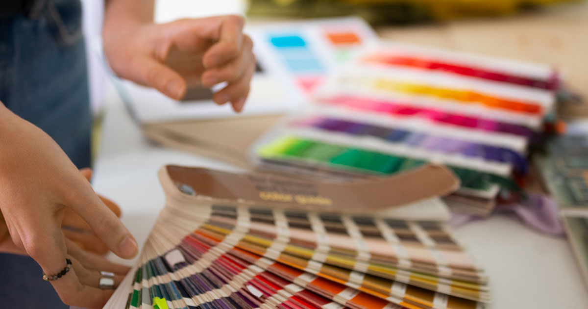
A printer matches Pantone colors using a physical reference guide, the printed swatch book that designers fan out to compare shades. The printed swatch is the reference, not the screen, because screens cannot display Pantone colors accurately.
When to Use PMS
Use Pantone when color consistency is the priority:
- Corporate logos and brand identity
- Packaging where the brand color must match across suppliers
- Letterhead and stationery for established brands
- Any job where a specific color must look identical across multiple print runs
A national brand uses Pantone so its blue looks the same on a business card printed in New York and a banner printed in Los Angeles. CMYK alone cannot guarantee that level of consistency because process printing can shift slightly between presses and paper stocks. For a deeper look at how these two systems compare side by side, see our guide on PMS color vs. CMYK.
Spot Color vs Process Color
The table below shows how the two printing approaches compare.
| Factor | Spot Color (PMS) | Process Color (CMYK) |
| Ink | Pre-mixed to a formula | Built from 4 inks on press |
| Consistency | Identical across runs | Slight variation possible |
| Best for | Logos, brand colors, 1 to 3 colors | Photos, gradients, full color |
| Cost on short runs | Higher setup per color | More economical |
| Color range | Includes colors CMYK cannot hit | Limited to process gamut |
Many real jobs use both. A brochure might print the body images in CMYK and the logo in a Pantone spot color to keep the brand color exact. If you need a reference for what Pantone colors are available, our pantone matching system color chart lists the full standard swatch set.
HEX: Color Codes for Web Design
HEX is a six-digit code used to define colors in web design and digital media. It is written with a hash symbol followed by six characters, such as #1A73E8.
How HEX Works
A HEX code is just RGB written in a different format. The six digits break into three pairs. The first pair sets red, the second sets green, the third sets blue. Each pair runs from 00 (none) to FF (maximum), using hexadecimal counting where the values go 0 through 9 then A through F.
So #FF0000 is pure red, the same as RGB R:255 G:0 B:0. The two formats describe the identical color. HEX is simply the standard way to write that color in website code and design tools.
When to Use HEX
Use HEX for digital work where colors live in code:
- Website styling
- Brand color guidelines for digital use
- Email and app design
- Anywhere a developer needs an exact screen color
HEX has no role in print. A printer cannot use a HEX code directly because it describes light, not ink. If you give a printer a HEX code, they convert it to CMYK or match it to a Pantone color first.
The Four Systems Side by Side
This table summarizes where each color code belongs and how it is written.
| Code | Full Name | Used For | Color Built From | Example Format |
| CMYK | Cyan, Magenta, Yellow, Key | Ink (subtractive) | C:0 M:99 Y:100 K:0 | |
| RGB | Red, Green, Blue | Screens | Light (additive) | R:255 G:0 B:0 |
| PMS | Pantone Matching System | Brand print color | Pre-mixed ink | PMS 186 C |
| HEX | Hexadecimal | Web design | Light (additive) | #FF0000 |
CMYK and PMS belong to the print world. RGB and HEX belong to the screen world. Knowing which side your project lives on tells you which system to design in.
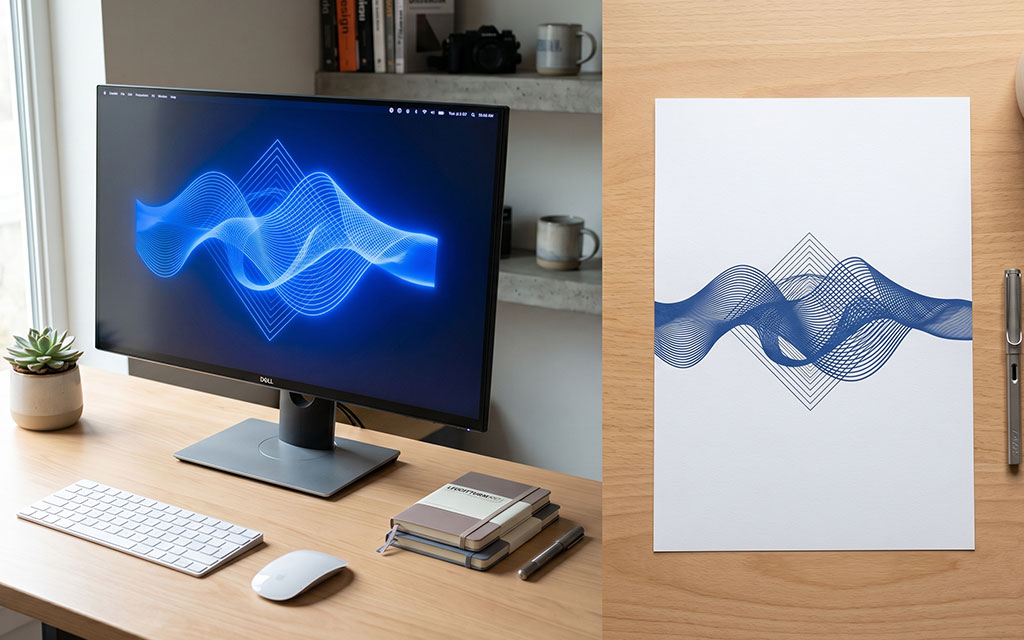
The RGB to CMYK Problem: Why Colors Shift
This is the issue behind most disappointing print results, so it deserves a closer look.
You design a logo on your monitor. The screen shows it in RGB, glowing with backlight. You approve it. The file goes to print, gets converted to CMYK, and the printed version looks flatter and darker. Nothing went wrong with the printing. The screen was showing you colors that ink cannot reproduce.
The colors most likely to shift are bright and saturated:
- Vivid blues often lose intensity and turn slightly purple or gray
- Bright greens flatten noticeably
- Neon and fluorescent shades cannot print at all with standard inks
- Pure, glowing oranges and reds soften
Three steps prevent the surprise:
- Design in CMYK mode from the start for any print project. Your software will display the realistic printable range while you work.
- Request a physical proof before a large run. A printed sample shows the true result, since your monitor cannot.
- Use Pantone for critical brand colors. If a specific blue defines your brand, a spot color removes the guesswork that CMYK conversion introduces. You can browse exact options using our screen printing ink colors reference to see the stock colors available.
For colors that fall outside the CMYK range and matter to your brand, Pantone is the reliable answer. A skilled printer can also adjust a CMYK build to get closer to a target color, but there are physical limits to what process inks can reach.
How to Set Up Files for Print
A few practical habits keep color predictable across every job.
Set your document color mode to CMYK before you start designing print materials. In Adobe Illustrator or Photoshop, this is in the document setup. Starting in CMYK means you never have to convert a finished file and absorb a late color shift.
Provide your printer with exact color values, not screenshots or descriptions. Give CMYK percentages for process work and Pantone numbers for spot colors. “Make it the same blue as our website” leaves room for error. “PMS 286 C” does not.

Build artwork at the final size with proper resolution. For print, that means 300 DPI at the actual dimensions of the piece. Low-resolution files print blurry no matter how good the color is.
Ask for a proof on any job where color accuracy affects the result. A digital proof checks layout and content. A physical proof on the actual stock checks color. For brand-critical work, the physical proof is worth the small added time.